The Market Profile™ (MP) offers an amazing way to analyze and trade the market. Understanding this powerful form of analysis can go a long way toward making you a better trader. However, reading and deciphering the information in its current format falls somewhere between complex and dense for the uninitiated trader. No worries. I’ll show you how I simplify MP so you can process the most pertinent information and incorporate it in your trading.
A Brief History
The Market Profile was created by J. Peter Steidlmayer in the early 1980’s in a joint effort with the Chicago Board of Trade in order to display the time and price relationship as it unfolded in the market. The result was a revolutionary way of viewing the market’s activity using a visual “profile” representing time and price. This breakthrough paved the way for a whole new realm of market understanding, as it created a level of transparency between buyers and sellers that had never been seen before.
Deciphering the Market Profile
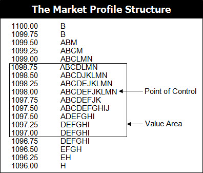
The Market Profile structure provides an in depth look at market participation at specific price points, which allows us to use the information to identify areas where price is overvalued, undervalued, and fair valued.
Let’s take a closer look at how the Market Profile is structured.
The structure uses letters of the alphabet to categorize segments of time next to price, which are technically called Time Price Opportunities (TPO’s). The first letter of the alphabet represents the first segment of time, which is usually the first 30 minutes of the day. The second letter will correspond to the second segment of the time, which is the next 30 minutes of the day, and so forth. Each new segment of time will correspond to a new letter until trading is done for the day. A letter is placed next to every price that the market traded at during that specific segment of time.
The profile will continue to build out as the day progresses, providing you with a real-time account of market activity as it unfolds. The resulting bell-shaped profile will give you an accurate picture of the day’s time and price relationship, providing you will key levels of interest for the current session and future sessions.
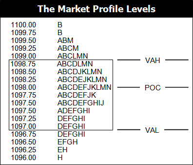
While the structure offers an abundance of information, the two areas that stand out are the Point of Control and the Value Area. The Point of Control (POC) is the price where the most trading activity occurred during the day, as represented by the longest line of TPOs nearest to the center of the entire structure. This price is significant because it represents the fairest price to both buyers and sellers. The Value Area is important because it illustrates where 70% of the trading activity occurred during the day. The Value Area High (VAH) and Value Area Low (VAL) tell you where buyers and sellers perceive price to be away from fair value.
Keep in mind, there are entire books dedicated to the Market Profile, which go way beyond the brief introduction that I have shared with you here. While this information can be used in a variety of ways, I’ll share my simplified approach with you.
Simplifying Market Profile
Alas, removing the clutter and revealing only the most pertinent information about Market Profile allows you to process the information in a manner that is both powerful and easily understood. Essentially, I am only concerned with the three most powerful levels of the Market Profile (POC, VAH, and VAL), which can be displayed as horizontal price levels on your charts, without the alphabet soup. At my company, we call this the Money Zone.
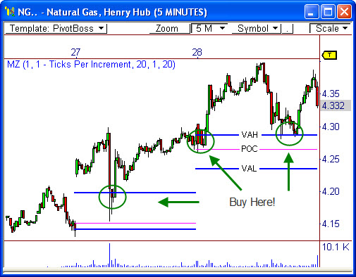
Take a look at the graphic below, which illustrates how the Money Zone translates the Market Profile structure into visual price levels. The Money Zone takes the point of control derived from the Market Profile and extends it as a horizontal price level for the following session. The Money Zone also extends the upper and lower boundaries of the value area for use in the following session as support or resistance levels.
Why are these levels relevant for the following day? Simply put, these levels show where market participants perceive prices to be overvalued, undervalued, or at fair value. Understanding this concept allows you to know when to pull the trigger in certain situations, like in the example below.
Now that you have a simplified understanding of how I interpret the data from the Market Profile structure, we can begin to process this information in a more analytical way, including concepts like two-day pivot relationships, pivot width analysis, and pivot trend analysis. I’ll cover these down the road.
What do you think about his approach? Leave a comment!
Frank Ochoa
PivotBoss.com
Follow Frank on Twitter: http://twitter.com/PivotBoss


Pingback: Volume at Price for Dummies | PivotBoss.com
Pingback: 3 Signs the Dow is Ready for a Breakout | PivotBoss.com
Pingback: Look Familiar? | PivotBoss.com
Pingback: I'm Watching This Today | PivotBoss.com
Pingback: Another Opportunity to Sell $NVDA | PivotBoss.com
Pingback: A Technical Look at the $SPX | PivotBoss.com
Sometimes minus development will line up with the floor trader pivots, providing us with low risk entries.
Pingback: New to PivotBoss? Start Here! | PivotBoss
Hi Frank
i am reading “the Pivot Boss secrets” but i don’t understand whitch platform or tools i have to use to display “Money zone”. I use Metastock but there isn’t the money zone indicators. Can you explain me this ?
Thanks so much
Dario